Frequently Asked Questions
Getting Started
How do I get rid of the watermark?
By purchasing a premium pass. A premium pass removes the watermark, enables unlimited downloads, and allows downloading the plot as an SVG file.
Purchasing a pass helps keep this place running and support development.
Unauthorized removal of the watermark may result in a lifetime ban.
What does making an account do?
Making an account is required for purchasing a premium pass.
Data Input
How do I quickly enter data?
Uploading a CSV file
You can upload a CSV file using the upload button above the table, or by dragging and dropping a CSV file onto the table. See “Uploading data” in the documentation on how to correctly format your file.
Pasting data
You can paste values directly into multiple data cells at once from Excel or Google Sheets. You can also copy plain text as long as the values are separated by tabs.
- First, select and copy multiple cells in Excel/Google sheets.
- In the table, select the first cell you want to copy in to. Make sure the cell is only selected and not being edited.
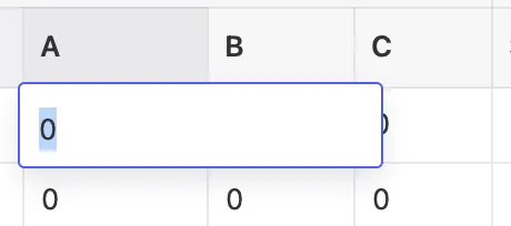
A table cell in edit mode 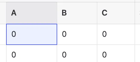
A table cell that is selected - Paste when the cell is selected and not in edit mode, multiple cells will be set at once.
Note that the cell values are validated on paste. A warning will be displayed for each invalid value.
Importing from Excel (Premium)
If you have your data in Excel or Google Sheets and a premium subscription, you can export it as an Excel (.xlsx) file and import it directly:
Download template: Excel Template (includes all required sheets and column headers)
- In Excel/Google Sheets, organize your data with column headers matching the required column names (a, b, c, title, etc.)
- Save or export as an Excel (.xlsx) file
- In TernaryPlot.com, click the Import button in the data toolbar
- Select Excel (.xlsx) and choose your file
The Excel file can include multiple sheets for Points, Lines, Areas, and Text data, plus a Metadata sheet for plot settings. All data will be validated and imported at once. This is the fastest way to import large datasets or multiple tables at the same time.
Note: Excel import is a premium feature. Free users can import data using CSV files one table at a time (see above).
See the Excel documentation for details on the expected file format.
How do I export and import my entire plot?
You can save and restore your complete plot (all data, configuration, and settings) using the export/import features:
Exporting your plot
Click the Export button in the data toolbar (above the tables) and choose:
- Excel (.xlsx) - Exports your plot data and metadata to an Excel workbook with separate sheets for each data table. Great for sharing with collaborators or editing in Excel.
- Full plot (.json) - Exports everything including all data tables, plot configuration, axis labels, templates, and legend settings. This is the complete backup of your plot.
- Plot data (.json) - Exports only the data tables (points, lines, areas, text) without configuration.
- Plot config (.json) - Exports only the plot configuration and settings without data.
Importing your plot
Click the Import button in the data toolbar and choose the same format you exported:
- Full plot (.json) - Restores everything from a previously exported full plot file.
- Plot data (.json) - Imports only data tables, keeping your current configuration.
- Plot config (.json) - Imports only configuration settings, keeping your current data.
- Excel (.xlsx) (Premium) - Imports data and metadata from an Excel file that was exported from TernaryPlot.com or manually created with the correct structure.
Tip: Use "Full plot (.json)" to save your work and restore it later. Use Excel export to share your data with colleagues who prefer working in spreadsheets.
How do I work with my data in Excel?
TernaryPlot.com supports exporting to and importing from Excel (.xlsx) files, making it easy to work with your plot data in Microsoft Excel or Google Sheets:
Exporting to Excel
- Click the Export button in the data toolbar
- Select Excel (.xlsx)
- Save the file to your computer
The Excel file contains:
- Separate sheets for each data table: Points, Lines, Areas, and Text
- A Metadata sheet with plot settings (axis labels, template, legend position)
- All your data with proper column headers
Note: Callouts and legend items are not included in Excel exports since they're primarily interactive UI elements. They are preserved in JSON exports.
Importing from Excel (Premium)
Note: Excel import is a premium feature. Free users can import data using CSV files one table at a time.
Download template: Excel Template to see the required structure and column headers.
- Click the Import button in the data toolbar
- Select Excel (.xlsx)
- Choose your Excel file
The import will:
- Load all data from the Points, Lines, Areas, and Text sheets
- Apply metadata settings like axis labels and template
- Validate all data and show errors if any values are invalid
- Filter out empty rows (where a=0, b=0, c=0)
Important: For import to succeed, your Excel file must have the correct structure. Keep sheet names (Points, Lines, Areas, Text, Metadata) and column headers exactly as exported. All data values must be valid, invalid colors, symbols, or out-of-range numbers will cause validation errors. See the Excel documentation for detailed format requirements.
Plot Elements
How do I add text to the plot?
Note: Point titles do not display as visible text on the plot - they only appear in tooltips when hovering. To add visible text labels to your plot, use the Text table.
Text can be added to the plot by entering values in the text table. Like points, text needs ternary coordinates (A, B, C values) to determine its position on the plot. You can use the crosshair tool to find the exact ternary coordinates for where you want to place the text - click on a location on the plot and the crosshair will show you the corresponding A, B, C values.
You can nudge the text around by adding x- and y-offsets to a text entry.
How do I add a legend?
See the Legend docsClick the Overlays button in the toolbar above the plot, then select Legend... from the menu. This will automatically enter edit mode where you can add items to the legend by clicking on plotted points, lines, or areas. Click the legend item text to change its label. Use the Clear Legend or Reset Position buttons in the settings panel as needed, then click Done when finished.
What columns are required in my CSV file?
CSV files are uploaded separately to each table (Points, Lines, Areas, or Text). Click the Upload button above the specific table you want to populate.
Required columns:
- a, b, c - Ternary coordinates (must be named exactly as
a,b,c) - text (Text table only) - The text content to display
Note: Column order does not matter. You can arrange columns in any order as long as the header names match.
Optional columns:
- title - Label for identifying rows (appears in tooltips)
- value - Used with Scales to assign groups/colors/symbols
- Other styling columns:
size,fill,stroke,opacity, etc.
See the CSV formatting documentation for complete column lists for each table type.
Minimal example for points:
a,b,c
30,40,30
50,25,25
20,30,50
How do I assign groups or categories to my data?
Use the value column in your CSV or table to assign groups or categories to your data points.
Example CSV with groups:
a,b,c,value
30,40,30,Group A
50,25,25,Group B
20,30,50,Group A
40,35,25,Group C
After uploading, use the Scales feature to automatically map these groups to:
- Colors - Assign different colors to each group
- Symbols - Assign different shapes to each group
- Sizes - For numeric values, scale point sizes
The value column works with both text categories (like "Group A", "Type 1") and numeric values (like temperatures or concentrations).
How do I create a line connecting my points?
There are two ways to connect points with lines:
- Click the Insert menu above the plot and select Draw Line. Now click the points you want to connect in the order you want them to be connected. Press and hold on the last point to finish the line.
- In the table, select and copy the points that form the line from the points table to the lines table. Reorder them if needed.
You can style the lines by changing their color, width, and dash pattern in the Lines table. See the Lines documentation for more details.
How do I add callouts or annotations with arrows?
Callouts are arrow annotations that point to specific locations on your plot. To add a callout:
- Click the Insert menu above the plot
- Select Draw Callout
- Click on the plot where you want the arrow to point
- Click again to position the label text
You can edit the callout text by double-clicking it, move it by dragging, and delete it using the trash icon that appears on hover.
Tip: To place callouts outside the plot boundaries, disable clipping in the Background section of the configuration menu.
How do I create filled areas or regions?
Areas create filled regions on your ternary plot. You can add them in two ways:
- Click the Insert menu and select Draw Area. Click points on the plot to define the boundary, then press and hold on the last point to close the area.
- Manually enter coordinates in the Areas table. Each row needs at least three sets of A, B, C coordinates to form a closed region.
You can customize the fill color, opacity, stroke, and other styling properties in the Areas table.
Features
How do I make a USDA Soil Triangle, Folk QFR Diagram or Dickinson QFL chart?
See the Templates docs.Press the "Templates" button in the toolbar in the right pane. This will open a templates dialog where you can select your template. It includes a button to hide the labels of the template as well.
How do I change the color or symbol of many points at once?
Select the rows you want to change, then use the bulk-edit bar that appears above the table:
- Select rows using the checkboxes on either side of the table, Shift/Ctrl/Cmd+click for a range, or by dragging across rows.
- A bar appears above the table with controls for that table's style properties (Fill, Stroke, Symbol, Size, Opacity, Dash, and so on).
- Pick a value and it is applied to every selected row at once. You can undo it with Ctrl/Cmd+Z.
Use bulk editing to style a hand-picked set of elements or to override a scale. To style elements automatically based on your data values instead, use Scales.
How do I use scales to color or size my points based on data?
Scales allow you to map data values to visual properties like size, color, or symbol shape:
- Add your data values to the "value" column in the points table. These can be numbers (e.g., temperature measurements, years) or text categories (e.g., "Group A", "Type 1").
- Click the "Scales" button in the points table toolbar.
- The dialog will automatically detect whether your values are numeric or categorical and show you statistics about your data.
- Choose an output property:
- Size - Make points larger/smaller based on numeric values
- Color - Color points using gradients (numeric) or discrete colors (categorical)
- Symbol - Use different shapes for different categories
- Configure the scale (type, color scheme, size range) and click "Apply Scale".
The scale will update all the corresponding cells in your points table. You can undo this with Ctrl/Cmd+Z if needed.
What's the difference between categorical and numeric scales?
The scales feature automatically detects your data type and shows different options:
Numeric scales
Used when all values in the "value" column are numbers. You can:
- Map to size using linear, logarithmic, square root, or power scales
- Map to color using sequential gradients (like viridis, plasma) or diverging schemes (for data with a meaningful center point)
Categorical scales
Used when values contain text or mixed text/numbers. You can:
- Map to color using categorical color schemes that assign distinct colors to each unique value
- Map to symbol to use different shapes for each category (circle, square, triangle, etc.)
The detection info panel at the top of the scales dialog shows what was detected and sample values, so you can verify it understood your data correctly.
How do I create a inset to show detail in crowded areas?
Insets create a magnified view of a specific region, perfect for showing detail when you have many overlapping points:
- Click the Overlays button in the toolbar
- Select Inset... from the menu
- Enter edit mode to configure the inset region and position
- Drag the handles to adjust the magnified area
- Click Done when finished
The inset shows a magnified portion of your plot while keeping the full plot visible for context. This is especially useful for overplotting scenarios.
Troubleshooting
I have entered data but I don't see anything on the plot?
In case the plot doesn’t show what you are expecting, check the following:
- Check if the element has ternary values i.e. the values are not (0, 0, 0).
- Check if all the plot elements are toggled in the toolbar above the plot. Blue means enabled, gray means disabled.
- Check if the fill and/or stroke color of the elements is the not same as the background color.
- Check if the opacity of the elements is not 0.
- Check if your color format has a opacity (alpha) channel that is set to 0%, for example
hsla(77 100% 50% / 0)
I have entered data for a point but it is not showing in the plot.
- Check if the points size is not set to 0.
- Also check if its opacity is not set to 0.
I have so many points plotted close to each other that I can’t distinguish them.
In case of overplotting, here's what you can do.
- Change the domains to focus on a specific region.
- Use a inset to show a magnified view of the crowded region while keeping the full plot visible.
- Decrease the size of the points by setting smaller radii in the size column.
- Decrease the opacity of the points.
- Make only the most interesting points larger and make the rest of the points much smaller or more transparent.
- Add the most interesting points last in the table. The points are plotted in order, meaning later points are plotted on top of previous points.
Configuration
Why doesn’t the plot show the number of ticks or gridlines I have entered?
The axes are smart in choosing a number of gridlines and ticks. The entered number is a suggested count for the number per axis.
How do I rescale the plot to focus on a specific region?
Use the domains controls to rescale the plot. Click the "View domains" button above the plot, adjust the slider to zoom in (values less than 1), and drag the shaded triangle to position your focus area. Click "Confirm domains" when done. See the detailed FAQ below for more options.
How can I change the domains? How can I zoom in to a part of the plot?
You can change the domains in two ways to focus on specific regions of the plot:
- Using the “Domains” section in the configuration menu (gear icon):
- Click the “View domains” button to see the current domain area
- Use the “Domain length” slider to zoom in/out (values less than 1 zoom in)
- Click and drag the shaded triangle to position it over your area of interest
- Use number inputs to precisely set domain boundaries for each axis if needed
- Click “Confirm domains” when satisfied
- Using the quick controls above the plot:
- Click the “View domains” button
- Use the slider to change the domain length
- Click and drag the shaded triangle to position it
- Click “Confirm domains” when satisfied
The domain values snap to the nearest 1% for precision. The shaded area shows the current visible region of the plot.
See the Custom Partial Domains documentation for more details on focusing on specific regions.
How can I change the axis direction from clockwise to counterclockwise?
You can change the axis direction using the “Reverse domains” toggle in the Domains section of the configuration menu (gear icon). This changes the axes from increasing in a clockwise direction to counterclockwise (or vice versa), and automatically adjusts the label and tick angles accordingly.
Why is my callout clipped?
Because clipping is enabled in the background section of the plot config. To fix this, open the configuration menu (gear icon) and navigate to the Background section. Disable the clipping option to allow callouts to extend beyond the plot boundaries.
Academic Use & Citation
How should I cite TernaryPlot.com in my publication?
If you use TernaryPlot.com to create figures for your academic publication, please cite this website in your paper. This helps other researchers discover the tool and supports continued development.
Recommended citation format:
Blom, J. (2025). TernaryPlot.com: Interactive Ternary Plot Creator.
https://ternaryplot.com
BibTeX format:
@misc{ternaryplot2026,
  author = {Blom, Jules},
  title = {TernaryPlot.com: Interactive Ternary Plot Creator},
  year = {2026},
  url = {https://ternaryplot.com},
  note = {Accessed: YYYY-MM-DD}
}
In your figure caption, you can write:
"Figure created using TernaryPlot.com (Blom, 2026)."
or simply include the URL in your acknowledgments or methods section.
Do I need to cite TernaryPlot.com if I use it for my research?
Yes, if you use plots created with TernaryPlot.com in your publication, you should cite this website. This is important for several reasons:
- It provides proper attribution for the tool used in your research methodology
- It helps other researchers in your field discover and use the tool
- It supports the continued development and maintenance of free scientific tools
- Citations help demonstrate the impact and value of open research software
Many journals require disclosure of software tools used in data visualization and analysis. Including TernaryPlot.com in your citations or methods section fulfills this requirement.
Can I use TernaryPlot.com for commercial or published work?
Yes, you can use TernaryPlot.com for commercial publications, academic papers, reports, presentations, and any other professional work. Premium pass holders can export watermark-free, publication-ready plots.
For academic publications, please cite the website as described above. For commercial use, attribution is appreciated but not required if you have an active premium pass.
Advanced
I need some feature but TernaryPlot.com does not have it. What do I do now?
TernaryPlot.com aims to be comprehensive enough for most users. I want to strike a balance between an intuitive user interface and number of features. That's why this app does not support every possible feature.
You can download the plot as an SVG and open it in an SVG editing software like Inkscape, Illustrator, or Figma.
Or check out one of the following software libraries for creating ternary plots:
- R language
- ggtern
- Ternary
- vcd
- Python
- mpltern
- python-ternary
- Pyrolite (geochemistry)
- PyGMT
- JavaScript
- Observable Plot
- d3 with d3-ternary
Question not in the list?
Well, ask it here: